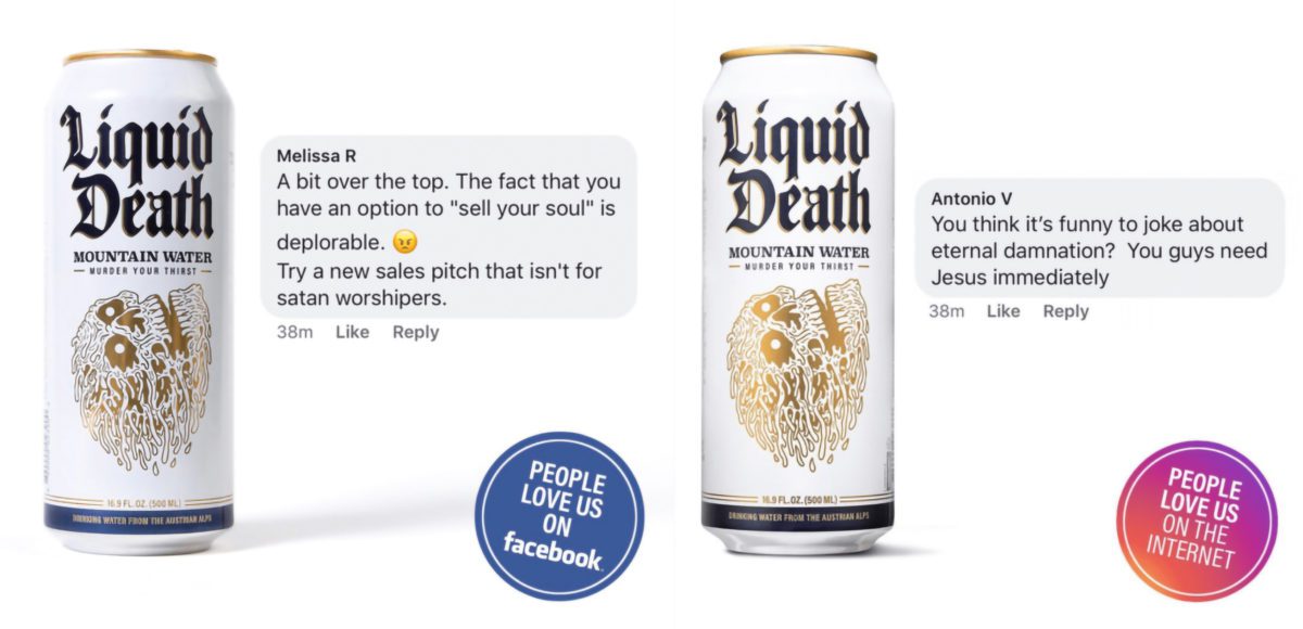
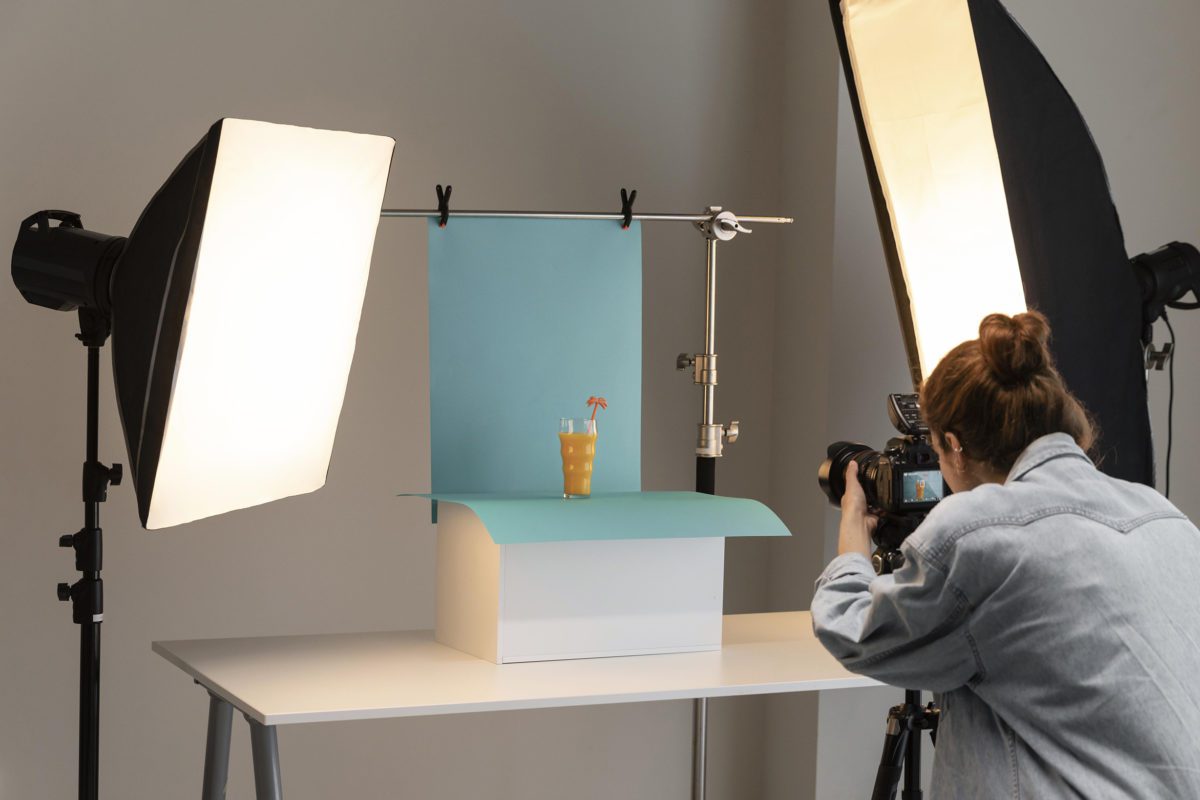
Be honest, are you having as much fun perusing the beer aisle for interesting packaging as you are cracking them open at home? From wicked cool illustrations to funky colors and far-out production techniques, some beer can designs have become straight-up works of art. Today, we’re highlighting some of the coolest beer packaging designs we’ve seen lately, and discussing why they work. Whether you’re a CMO, a marketer, a beer can design lover or just someone looking for a little inspiration, you’ve come to the right corner of the internet.
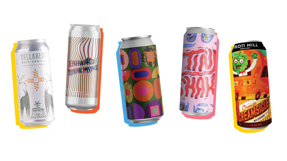
Why Packaging Design Matters in Beer Branding
Ever walk down the giant beer aisle at your local store and pick something up just because the label caught your eye? You’re not alone. According to Nielsen data, around 66% of American craft beer consumers say they are very or extremely likely to buy a craft beer based on its packaging or label. That’s especially pertinent recently, as the number of registered craft breweries has increased 5X in the last decade alone. With so many options the grocery store beer aisle is starting to look more like a candy store. Walls of beer, filled with rows of brightly colored cans and illustrated boxes that look like they were plucked directly from your favorite artist’s fever dream.
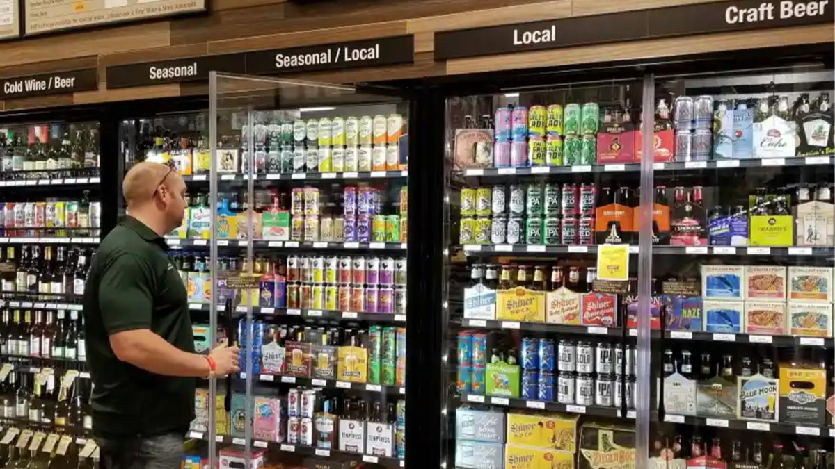
But it’s not just about looking cool, it’s about quickly communicating brand value in a cluttered space where other packaging is vying for limited attention. Well-executed packaging design should visually represent everything a consumer needs to quickly know about the beer, from the flavor to the vibe of the brand. In a world full of beer options yelling at you, your packaging needs to do some serious smooth talking. First impressions matter, and the first impression of a beer brand is its packaging. If it doesn’t grab a customer’s attention, they’ll probably just walk on by.
What Makes a Great Can Design?
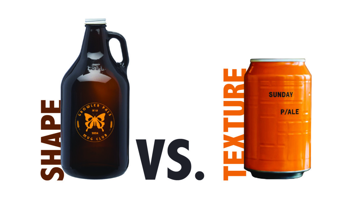
Colors say a lot. If you look at beer can packaging from the 70s, almost all cans were designed using some combination of red, gold, white and black. Nowadays every color under the sun is on the table, so long as it’s done well. But if you’re looking for a retro look, we suggest starting with the colors above. Dark tones like black or green often exude a bold, rich vibe, appropriate for full-bodied beers like stouts or porters. Bright colors scream “refreshing” and “fun” and may be more appropriate for citrusy IPAs, pale ales or wheat beers. You can even use pastels to enhance an organic, farmhouse-style, “handcrafted with care” feel. Whichever color palette you select, just make sure it’s selected with intention.

Fonts are key. Font choices communicate a lot about your beer’s character and brand. Want to evoke an old-school vibe? Try a slab serif. Want something modern and daring? A bold sans will do the trick. A bold font might also imply the strength or heaviness of a beer, whereas a lighter, script-y font may allude to a lighter tasting beer. Even ditching traditional fonts all together for a custom font that looks handwritten can craft the perception of small-batch brewing. There’s a lot of thought and nuance that goes into font selection. When designing packaging, we always recommend aligning fonts with your brand identity and product personality, considering factors like whether it’s modern or classic, playful or serious; and ensuring it’s easily readable across various mediums while maintaining consistency with your brand message.
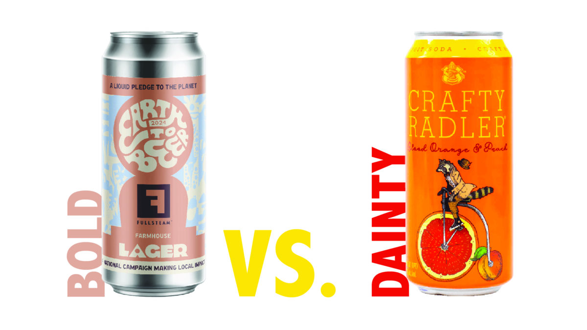
Logos and illustrations are crucial in beer can logo design. An embrace of minimalism often communicates, “We’re premium.” Quirky characters, on the other hand, call out to the more adventurous beer drinker in all of us. As the literal delivery vehicle of your product, your customer interacts with your can design every time they enjoy your beer and the truth is, it has the biggest opportunity for differentiation. There are only so many colors and fonts, but if you make your can is a work of art that also encapsulates your brand identity, you can create a singular experience that makes your product memorable. – mention the strength of iron hill here.
Creative Shapes and Textures
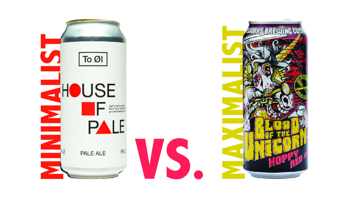
Why settle for smooth cans when you can add texture and unique shapes? Whether it’s something like a growler or crowler or the weight of the can itself, a distinct takeaway packaging design can make a beer stand out. Some shapes scream “premium” and instantly give off a sense of higher quality, turning the beer into a great gift option. Beer is also one of those areas in life where size matters… meaning we always recommend considering drinkability within the context of probable use cases. Choosing a 19.2 ounce over a standard size can for example, allows for placement in stadiums and event spaces where retailers are aiming to increase individual transaction price because the number of transactions are limited by the point of sales (think waiting too long in line at a concession stand. Adding texture and size variation isn’t just about looking cool, it makes the beer more fun to hold and functional to drink, often adding an improved dimension to the experience.
Source: DesignRush
Design Trends to Keep in Mind
Label Readers
Label reading is on the rise, with nearly 4 out of 5 adults aged 20 or older reporting they regularly read labels and nutritional info when deciding to buy a food product for the first time, according to the USDA. Make sure to add relevant information to your label, but we don’t just mean nutritionally. Including extra info like where the beer’s from, the style and the ABV can make your customers feel more informed and connected to your brand. For instance, consumers often look for specific beer types, like an IPA or stout, depending on their preferences. Flavor notes like “hints of tropical fruit and pine” or “malty with a caramel finish” help set expectations for taste and build anticipation, and the incorporation of flavor scales such as IBU or The International Bitterness Units are becoming more ubiquitous on beer packing. Alcohol content? That’s a factor for plenty of people, whether they’re looking for something sessionable or strong. Taste aside, the brewing process is even a factor for some consumers. If you’ve got something special brewing, we recommend highlighting any unique brewing techniques like “dry-hopped” or “barrel-aged.” Consumers love to know if they’re trying something experimental or handcrafted with care. Even the brewery’s location can make a difference in perceived quality. Beers from well-known brewing regions like Belgium or the Pacific Northwest often carry more cachet. There are endless factors to consider, but nothing can communicate your differentiators swifter than well-crafted copy. You just have to understand what’s important to your audience. The content your design highlights should align with your demographic’s decision-making focus to hit the right note with your desired drinkers.
Artist Collaborations
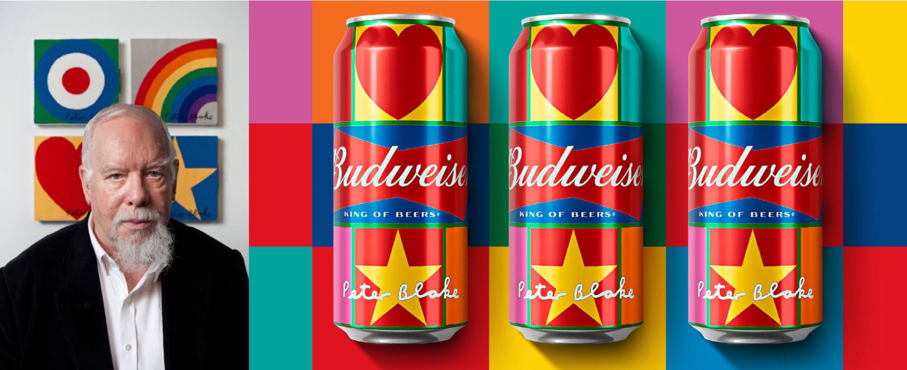
Some of the coolest beer cans often come from collabs with artists. Greene King is one example that uses vibrant colors and unique illustrations, making each can feel like a mini art piece. Another great one is Buffalo 9 Brewing, which uses rough, watercolor-style artwork to tell a story. These artistic collabs not only make the can stand out and easily recognizable, but they also turn it into something people want to collect. They also have the added bonus of introducing your brand to a group of people who may have never engaged with it before but are fans of the artist you are collaborating with.
Sustainability
Sustainability is a huge concern and it’s not just a buzzword in the beer biz. A 2024 McKinsey survey found that 79% of respondents are willing to pay more for sustainably packaged products, and brewers are taking note. Take Carlsberg’s Snap Pack, for instance. They’ve replaced plastic rings with glue dots, cutting plastic use by over 70%. Then there’s Saltwater Brewery with their Eco Rings, which are totally biodegradable and even safe for animals to eat. Yep, that’s a thing. If you’re looking to go green, there are some seriously cool options out there and it might just help you sell more product.
Sources: Eco-friendly Beer, Spark Innovations
Innovation
Beer packaging isn’t just about looks anymore either, it’s interactive too. We likely all remember the first time we saw the mountains turn blue. If you don’t, let’s take a trip back to 2007, when Coors Light incorporated thermochromic ink into their can design to create mountains that changed from white to blue when the cans reached 43 degrees. Coors Light touts that blue mountains mean “Mountain Cold” and the beer is at optimal drinking temperature. While the innovation was a gamer changer, it also aligned Coors brand value, reinforcing it as a cold, crisp and refreshing beer brand.
And sometimes innovation moves beyond the can. Corona’s Fit Pack is a great example. It lets you screw the cans together, creating a fun, stackable experience that eliminates waste. And don’t forget about augmented reality labels that let you scan and reveal surprises. They’re all about turning the drinking experience into a digital adventure.
Source: Spark Innovations
Seasonality
Brewers boost sales by producing seasonal brews that cater to preferences for fresh, limited-time offerings. According to a study by Brewbound, seasonal craft beers account for 17% of total annual sales in the craft beer category. These beers create urgency, encouraging customers to purchase them before they’re gone, with Brewers Association noting that seasonal beers often generate a 5-10% sales lift during their peak season. Additionally, Nielsen found that nearly 70% of craft beer drinkers say they actively seek out seasonal releases, enhancing brand engagement and driving repeat sales. Even crazier still, is 65% of consumers say simply describing an item as seasonal enhances their perception of the flavor, implying sometimes it doesn’t even come down to changing a recipe as much as it’s about reworking your can design to highlighting existing ingredients through the lens of seasonal flavors and imagery.
However, while repacking might be enough for some, many brewers relish the opportunity to create seasonal flavors and designs. Take Iron Hill Brewing for example, who looks forward seasonal showcases such as Oktoberfest or the creation of its Pumpkin Ale. And When fall fades into winter they’re slinging cans of Spruce Moose, Reindeer’s Revenge and Winter Warmer. These seasonal offerings help Iron Hill create a sense of occasion and exclusivity, encouraging customers to visit during specific times of the year to experience unique brews and can designs.
Iron Hill Brewery

Branding Lessons from Beer Can Designs
At the end of the day, beer packaging is about way more than just slapping a label on a can. If your brewery has built a reputation for great beer, make sure it’s exemplifies through your beer cans and your packaging designs. Brand familiarity plays a huge role in consumer decision-making. A trusted brewery with a solid story or backstory about the brewmaster and how the beer came to life, can really connect emotionally with your audience. Your label wields power. It’s your chance to tell your story, show off your brand’s personality and make people feel something. And if you can make them feel something, then you have an opportunity to sell them on your brand. Otherwise, you’re not even part of their consideration set. And remember, your can is a mini billboard every time a person sees it in their fridge or cooler. Not every product has an opportunity to reinforce its brand every time it’s used, but beer certainly does. In the beer business, they like to say it’s the outside of the can that gets you the first sale, but what’s inside keeps people coming back.
Got a favorite beer can design? Share it with us or hit us up on social media! Beer packaging isn’t just a pretty face, it’s the start of your brand’s story.

